Case study
WOW, the cultural social network
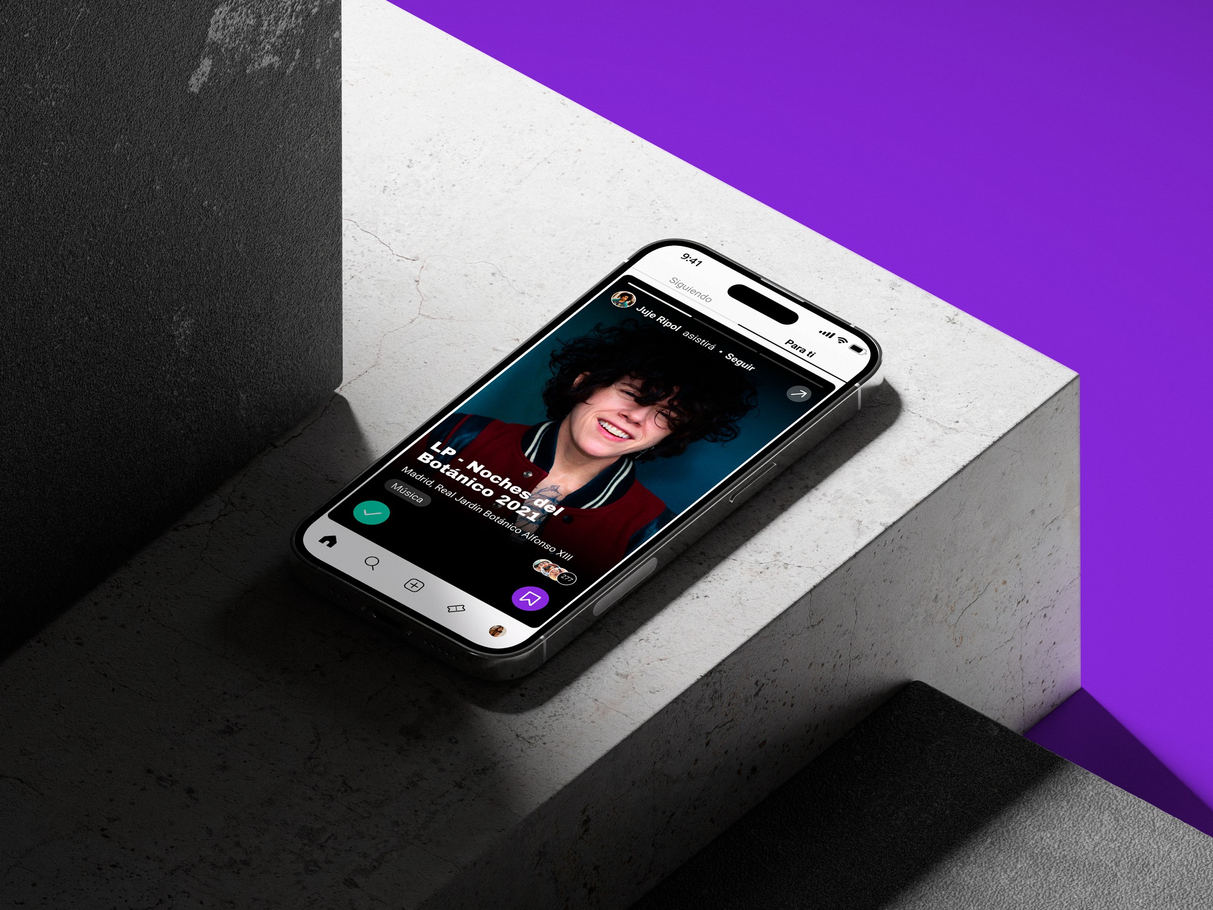
The question that started this project was simple: young people say they love art and culture, so why don't they actually engage with it more? I wanted to find out. As my final project at the UX/UI Design Bootcamp, I set out to design a social experience that would make culture feel as accessible and social as scrolling through Instagram.
Role
Product Designer
Services
Product Strategy · Research & insights · Interaction · UX Writing · Visual design · Prototyping
Date
May 2021
Research
I launched a survey with 89 respondents and conducted 8 interviews with people aged 14 to 38. The most revealing finding: almost everyone stored recommendations in phone notes and screenshots. The behavior was already there. The infrastructure wasn't.
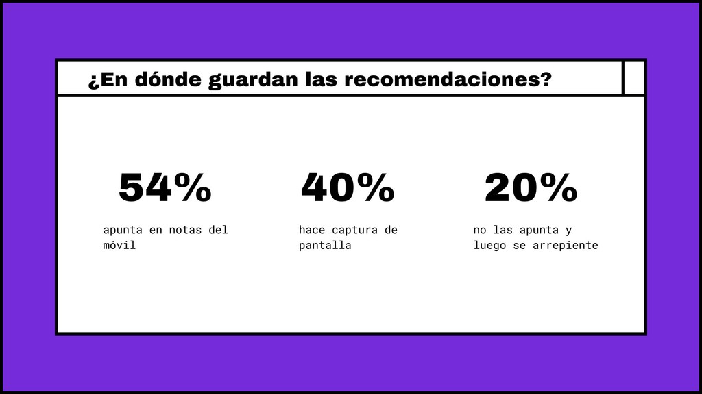
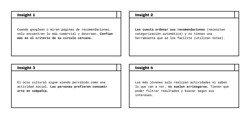
One quote reframed the whole problem:
"If I go to an exhibition, I have to leave the house, the stakes are higher. I need to trust the recommendation a lot more."
—Guillermo, 27.
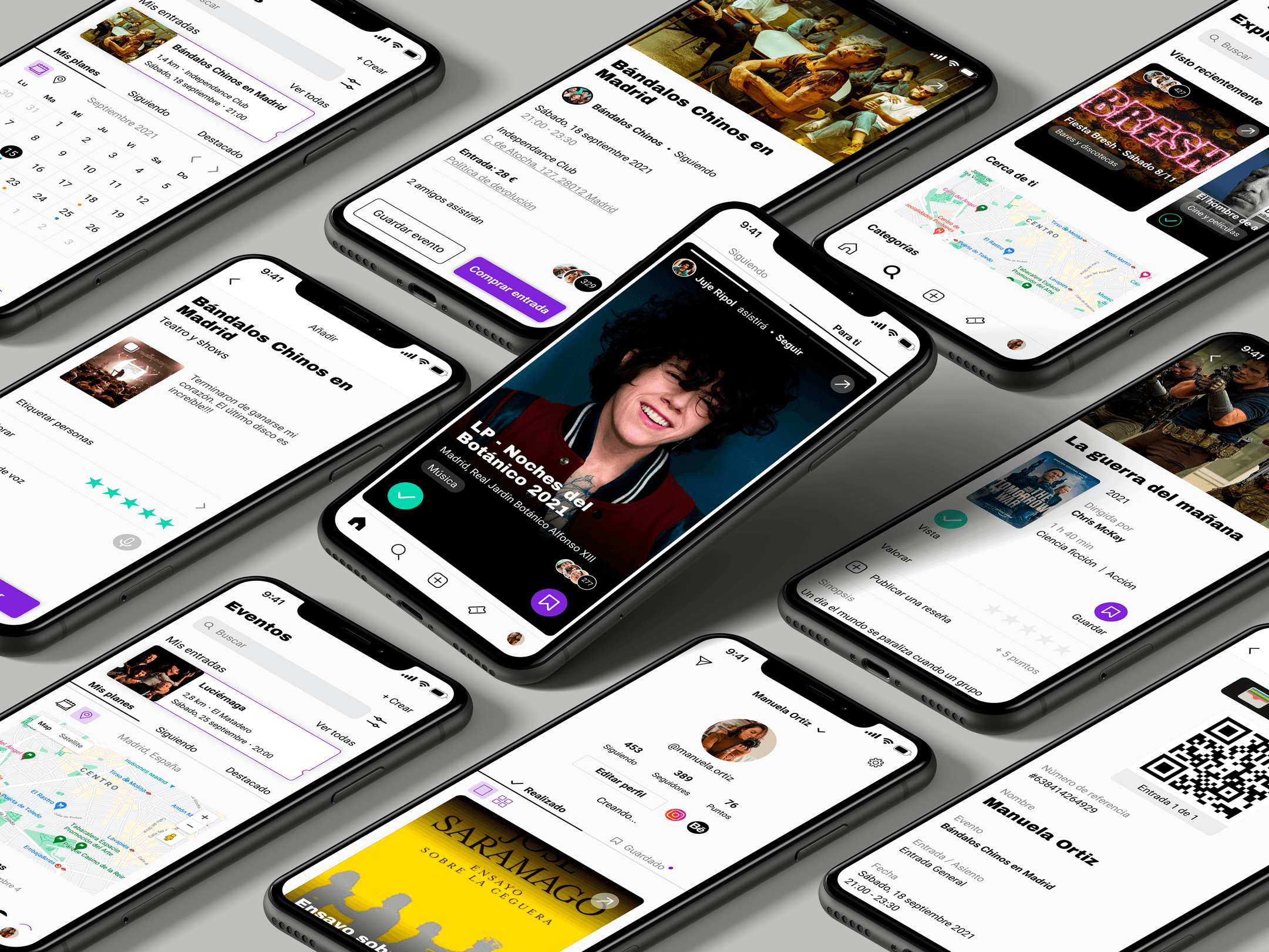
Users wanted one place for recommendations and events, filtered by their own interests, showing what their close circle was actually consuming. Word of mouth from friends beat algorithms every time.

Design solutions
The cultural Tinder
My initial references were Instagram and TikTok. But halfway through the wireframes, I realized the core interaction wasn't sharing, it was collecting and deciding. Swiping to save or dismiss turned out to be a much more honest model for that behavior, and it mapped directly to how people already managed recommendations in their notes app.
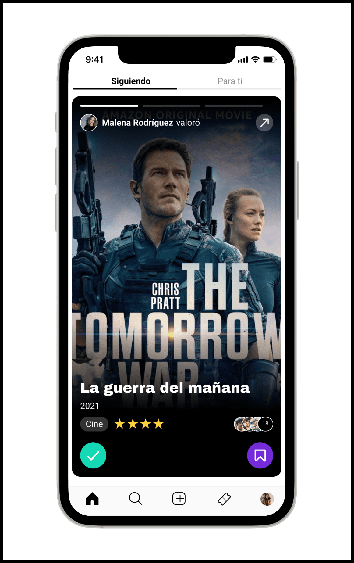
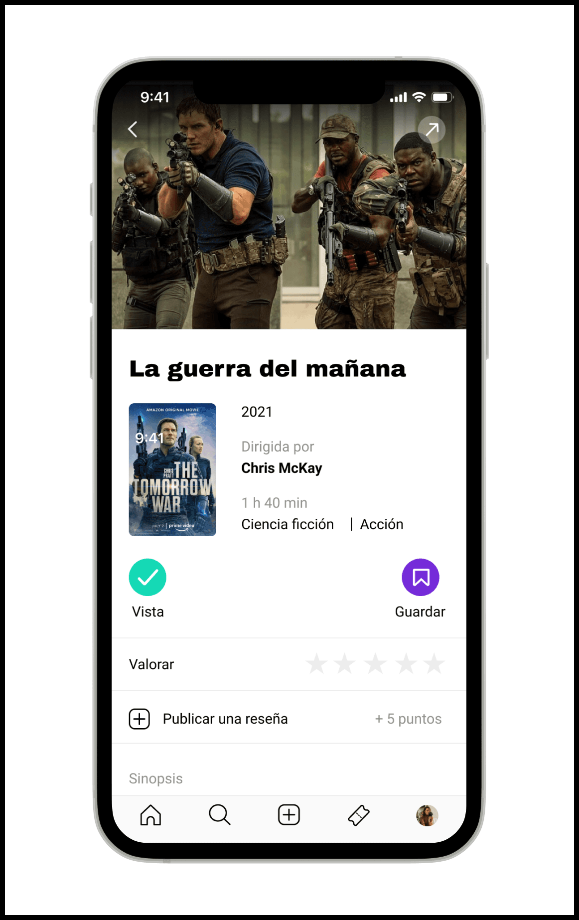

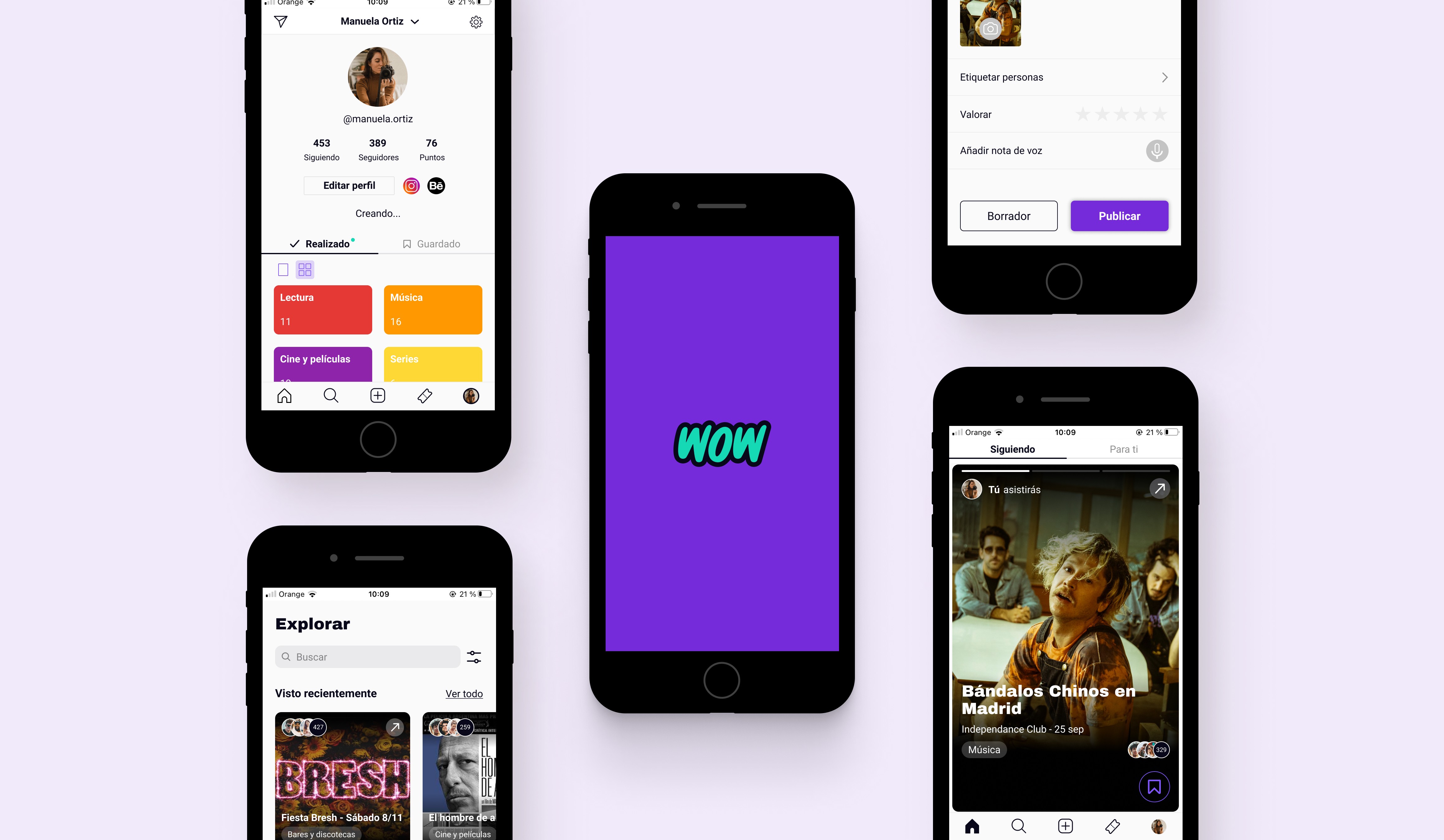
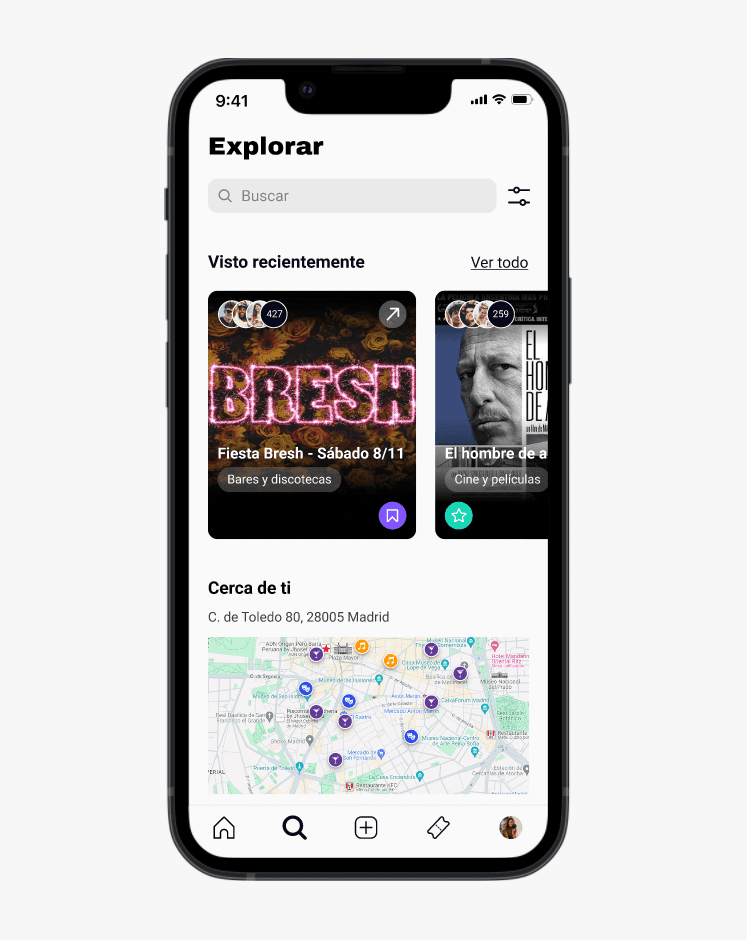
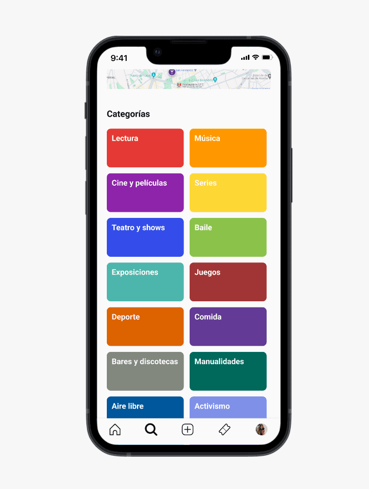
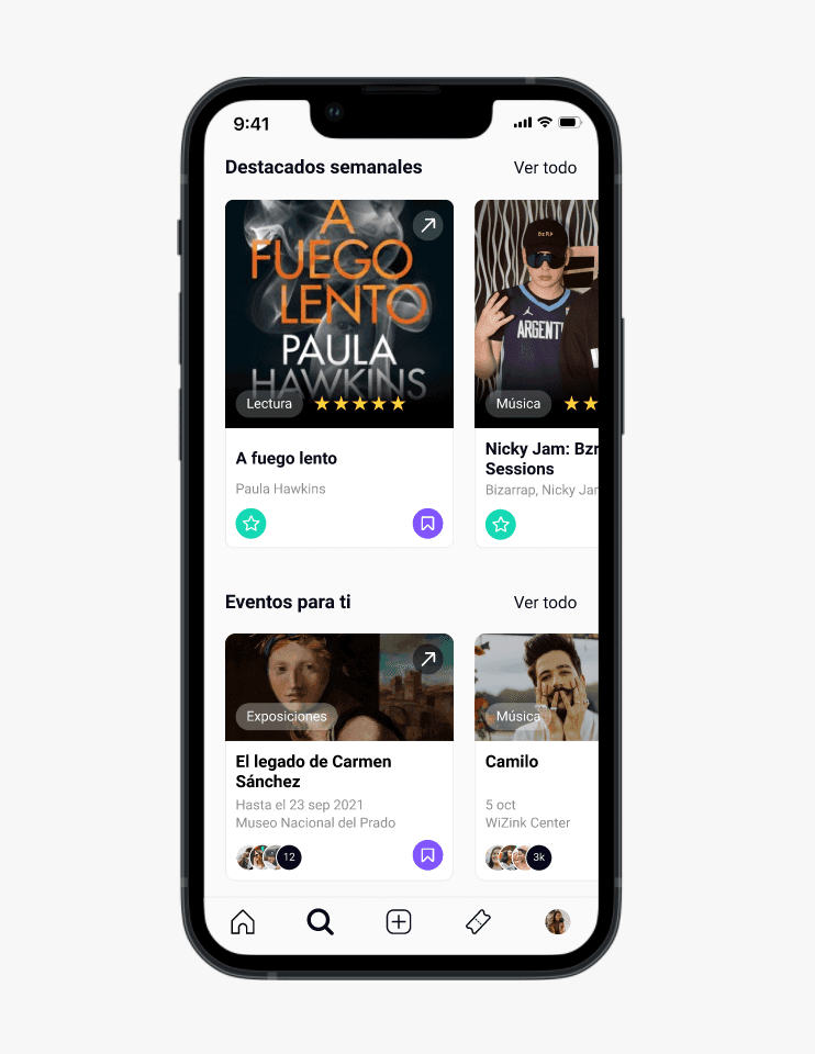
Explore categories and discover recommendations
Younger users wouldn't engage with unfamiliar content unless they could filter by what they already cared about. Discovery needed a safe entry point before it could become adventurous.
Discover events and buy tickets
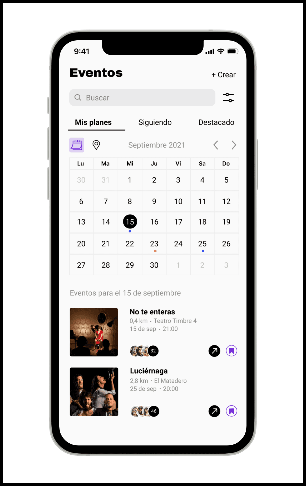
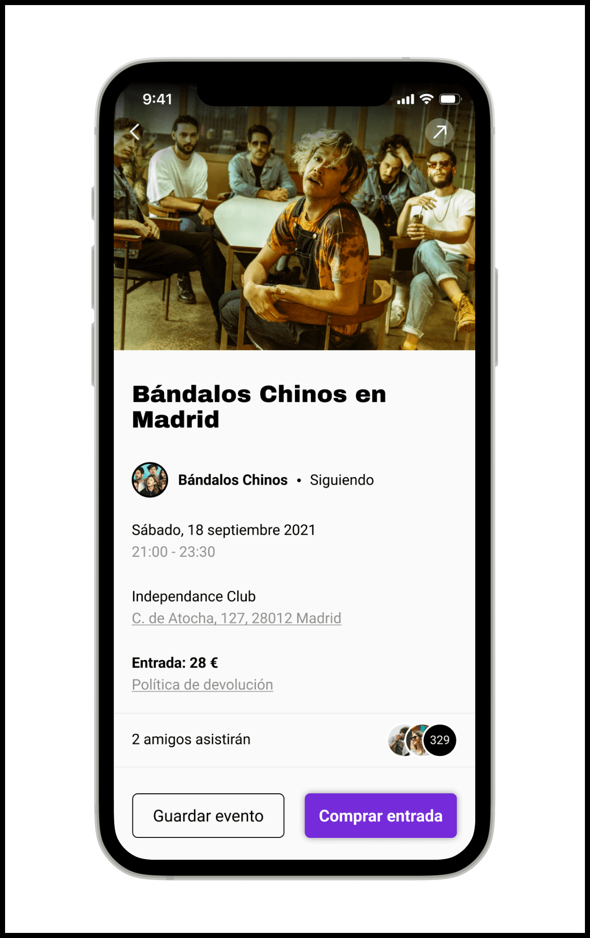
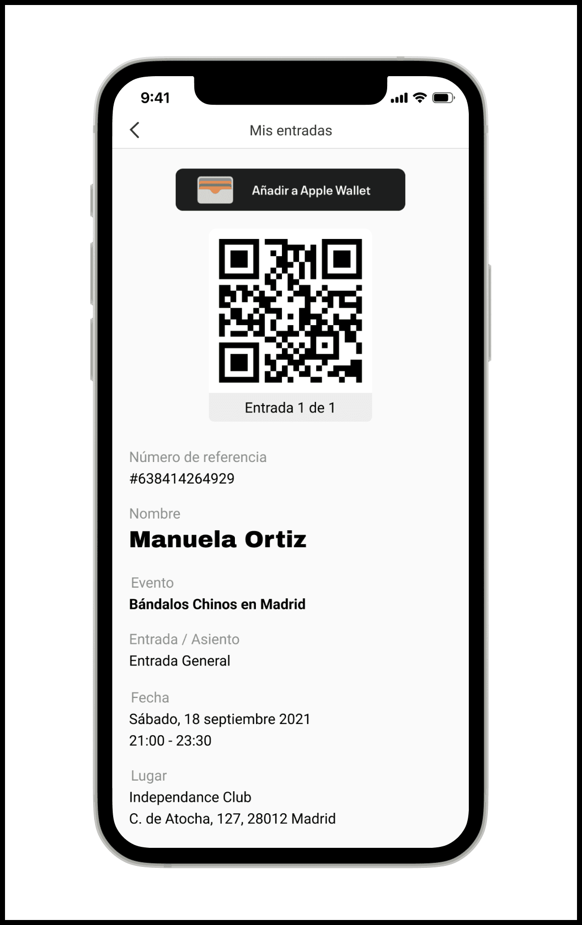
People were losing momentum switching between apps to buy a ticket after a friend's recommendation. Keeping that flow inside WOW solved the friction, and gave the product a clear monetization model.
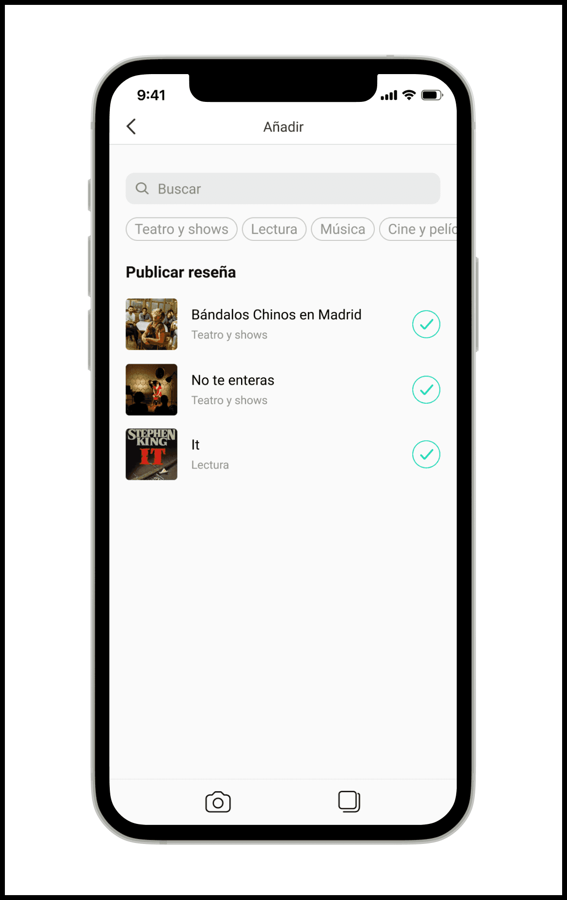
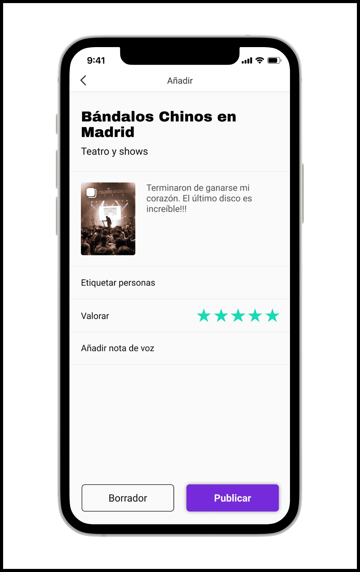
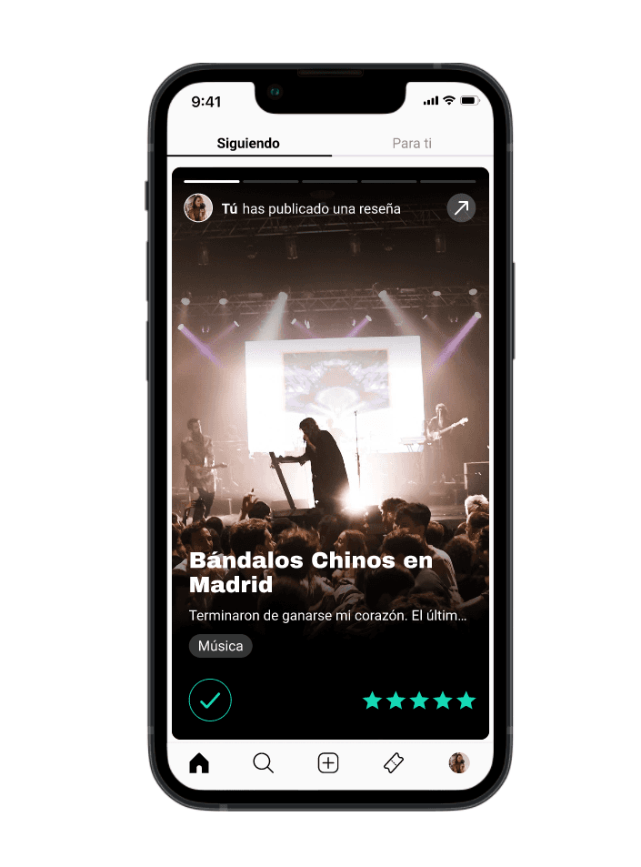
Add a recommendation
Based on research insights, I proposed a design solution to drive adoption: letting users add recommendations as easily as saving a phone note.
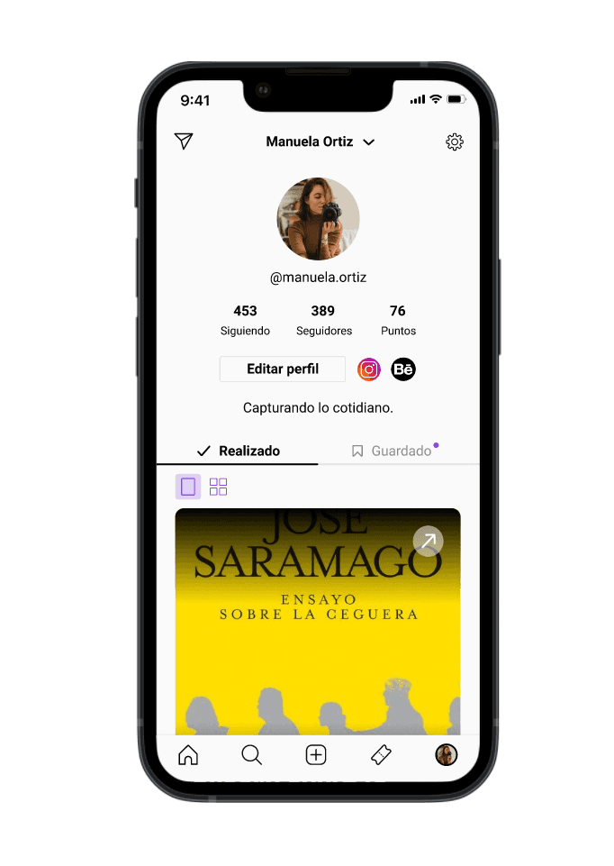
I built this feature so users could keep doing what they already do with recommendations they receive, but with everything centralized in one place, automatically categorized, and visible to their circle.
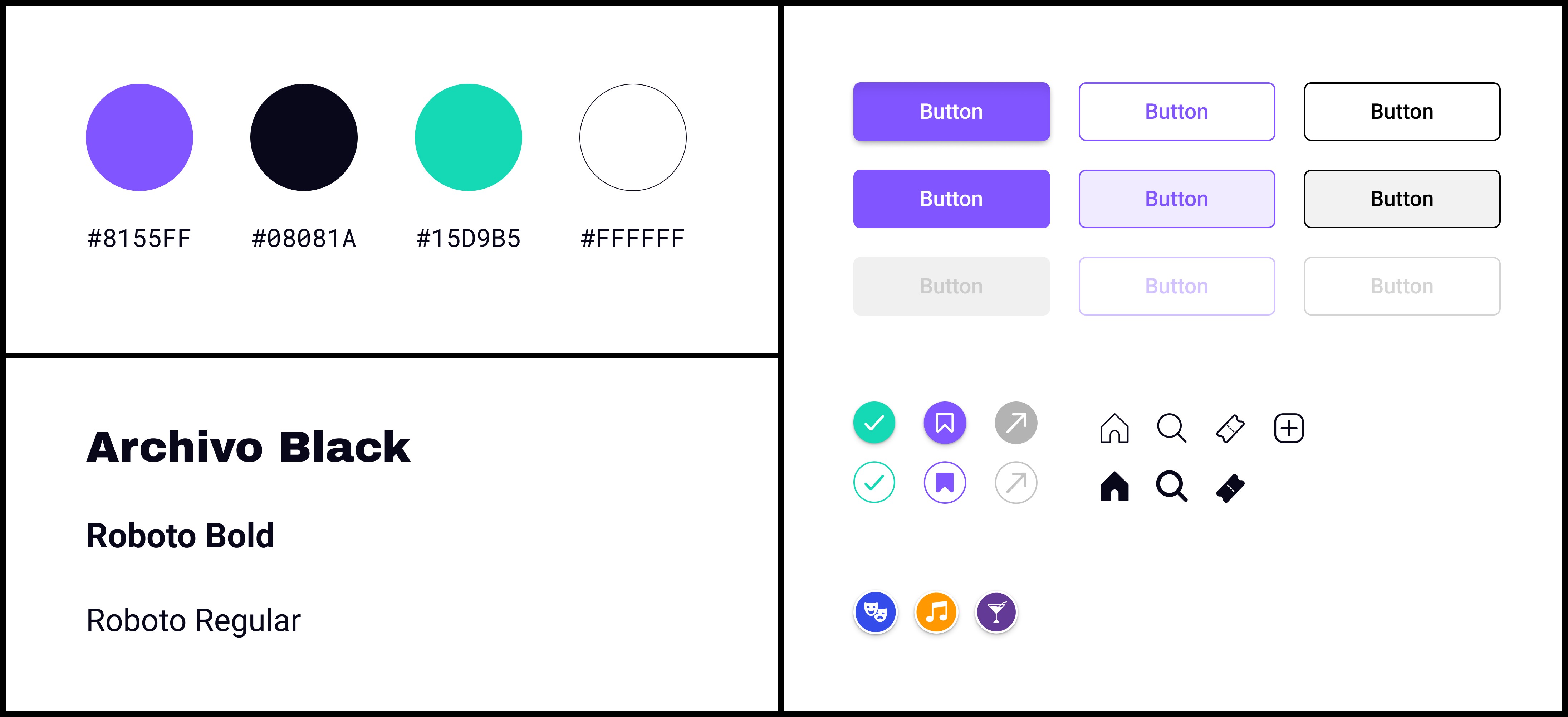
I wanted the brand to feel young and creative. My starting point was nostalgia: 90s TV aesthetics, graffiti, cartoons. I chose teal as the base color and derived violet as the primary accent through color theory.
The name WOW is short, impossible to forget, and a little audacious, right for an app about experiences designed to leave you speechless.
Here you can see the user flow of someone using WOW to find a plan for Saturday, grab a ticket, and post a review after the event.